Logo design is an art form, and, as is mostly the case in design – less is more. The idea is to seduce the viewer and make the impression memorable. With so much distraction around us, who needs all the Schnickschnack (German for chatter). Now, I don’t recommend for a startup company (maybe you?) to undertake branding or logo design if you don’t have the proper years of experience. “I’ll do it right when I have the cash” might be your answer. But, you know you are cheating yourself out of looking polished (speak lost business). This brings me to logo designs that shiver me timbers.
5 - UNILEVER
I think they had noble intentions when designing the logo. 25 icons are embedded in the U design. Step back and it looks like a germ farm, something cancerous, or one half of a fried onion ring.

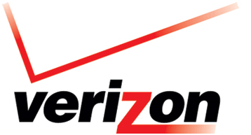
4 - VERIZON
The Verizon logo looks… hmm… old, outdated and quirky. Use only one gimmick in your design. Let’s see… a checkmark, a stretched Z, italic, and red fading lines. It looks like the ’80s. Oh, is that a checkmark or the edge of a building falling onto the name? Please, redesign! Only then will I consider your business.

3 - REMAX
I guess we see this logo on every street, therefore, making us cave in and accept our ugly fate. Darn close to Verizon, what’s with all the crossing and lines? Fits more for the local fencing club I think (you know, daggers and swords). Update: Luckily RE/MAX was listening to me :). The new logo looks much better. Please visit our Remax business card page for fresh new designs.

2 - IHOP
Step back and marvel at the IHOP logo. Do you see the sad face? In fact, the “P” droops down like Mr. Squidward’s (SpongeBob’s neighbor) nose. I also think blue is not the color to think about food -red and yellow are. Supposedly the folks at IHOP decided to launch a new prototype logo. Now, that one is outright creepy. Shocking might be good, but not for the food business. What do you think?

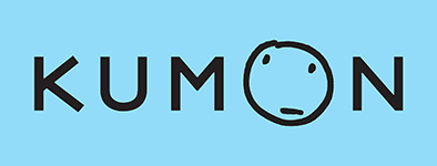
1 - KUMON
What’s wrong? For starters, the name. It sounds like something pretty nasty (Hugh Hefner knows what I mean). This company is about learning and kids. Now doesn’t that logo make you cheery? Enough said!

In conclusion.
We all are aware of the importance of a good logo and good design in business. At a very minimum, your marketing should include unique business cards adorned with a modern logo . Today's trends are asking for bold colors and minimal logos. Don't belittle these facts as you will shortcut yourself. We are experts with lots of years in the design and printing business. We offer online printing services which require some rather high tech programming. However, our business is rather old fashion. We believe in customer contact and we check each and every print job to make sure margins are respected, the text is properly aligned and many other variables.
What makes a modern logo?
Minimal design. Have one (1) "gimmick" in your design. A line going across, a letter protruding and extra icons within the logo are all considered a gimmick. Novices usually revert to this technique, adding lots of features. You can spot those mom and pop businesses from a mile away.